For a Universal Windows App I wanted to implement a Pivot. Reading the guidelines for tabs and pivots by Microsoft, I got inspired by the examples given.
However, no code samples are supplied so there is no indication how to create this in your own Xaml app.
In this article I will show the different steps to get the basics done and I will supply the source code for you to use.
The examples
For mobile

For desktop

The default Pivot
The default Pivot control looks just like the pivot we know from Windows Phone.
<PivotItem Header="item 1"> <TextBlock>Content 1</TextBlock></PivotItem>
Adding an icon to the header
So, the first step is to add an icon and do some styling. A bit lazy I used the Pivot sample from the Windows Universal Samples as a starting point.
<PivotItem> <PivotItem.Header> <local:TabHeader Label="item 1" Glyph="" /> </PivotItem.Header> <TextBlock>Content 1</TextBlock></PivotItem>
Immediately we spot a problem. It seems the Pivot Header has a fixed height.
Browsing around I found a MSDN forum post and a Stack Overflow question about this. Both are resolved using code to adjust the height of the items.
Because we want a responsive solution where the height is not known beforehand, code is not the best option.
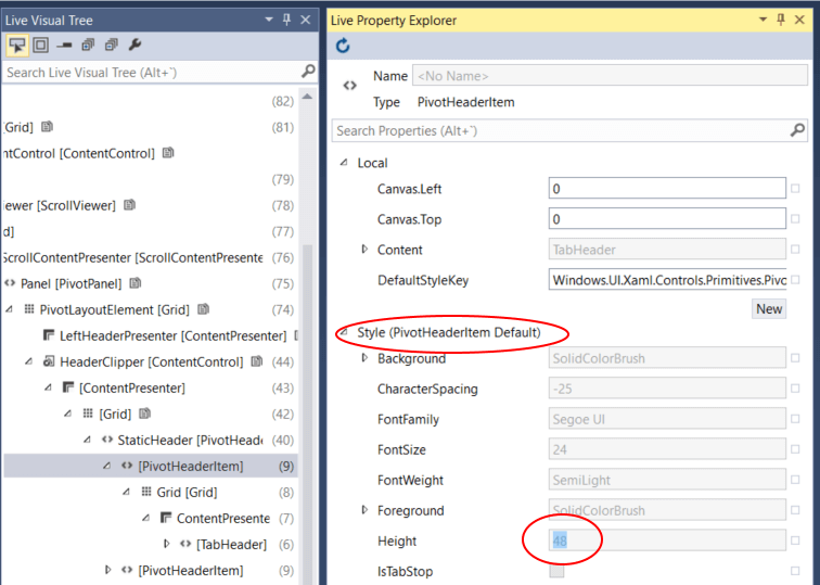
Lucky for us, Microsoft has added the Live Visual Tree tool in Visual Studio 2015 making it possible to debug what is happening in the app at runtime.
This shows that the PivotHeaderItem control has a default Style with a fixed height.
The problem is that Visual Studio does not have any option to edit (a copy of) this template. So, we have to get it the hard way.
To find the default template of every control and style in UWP apps we have to go to the following file:
%ProgramFiles(x86)%\Windows Kits\10\DesignTime\CommonConfiguration\Neutral\UAP\10.0.10240.0\Generic\generic.xamlLook for the PivotHeaderItem template and copy it to the Resources Dictionary for your preferred scope.
In the Style we change the Height to Auto.
<Setter Property="Height" Value="Auto" />If the height of your pivot header can be less than 36 you will also need the modify the height of the Previous and Next buttons in the Pivot Header as these have a fixed height too. These changes are made in the Pivot Style.
<Button x:Name="PreviousButton" ... Height="Auto" ... /><Button x:Name="NextButton" ... Height="Auto" ... />Create a copy of the Pivot Style
If you don’t know how to edit a copy of a Style, here are the 3 steps to follow:
- Select the Pivot in the Document Outline
- Right Click and select Edit Template
- Choose Edit a Copy…
Make the Pivot Header Item responsive
First, I will list how I want the header items to respond:
- If the app is narrow, the icon is centered above the label
- If the app is wide, the label is on the right side of the icon
- The transition from narrow to wide is at
500
Getting this working is quite easy in UWP apps without writing any code at all.
For this we use the new AdaptiveTrigger class and the RelativePanel control.
We alter the TabHeader.xaml adding a RelativePanel for layout and VisualStates for the transition. Something like this:
<VisualStateManager.VisualStateGroups> <VisualStateGroup> <VisualState x:Name="Narrow"> <VisualState.StateTriggers> <AdaptiveTrigger MinWindowWidth="0" /> </VisualState.StateTriggers> <VisualState.Setters> <Setter Target="Icon.(RelativePanel.AlignHorizontalCenterWithPanel)" Value="True" /> <Setter Target="LabelText.(RelativePanel.Below)" Value="Icon" /> <Setter Target="LabelText.(RelativePanel.AlignHorizontalCenterWith)" Value="Icon" /> </VisualState.Setters> </VisualState> <VisualState x:Name="Wide"> <VisualState.StateTriggers> <AdaptiveTrigger MinWindowWidth="500" /> </VisualState.StateTriggers> <VisualState.Setters> <Setter Target="Icon.(RelativePanel.AlignVerticalCenterWithPanel)" Value="True" /> <Setter Target="LabelText.(RelativePanel.RightOf)" Value="Icon" /> <Setter Target="LabelText.(RelativePanel.AlignVerticalCenterWith)" Value="Icon" /> <Setter Target="RelativePanel.Margin" Value="0,0,12,0"/> <Setter Target="Icon.Margin" Value="0,0,0,0"/> </VisualState.Setters> </VisualState> </VisualStateGroup></VisualStateManager.VisualStateGroups><RelativePanel x:Name="RelativePanel"> <FontIcon x:Name="Icon" HorizontalAlignment="Center" Margin="0,12,0,0" Glyph="{Binding Glyph}" FontSize="16" /> <TextBlock x:Name="LabelText" Text="{Binding Label}" Style="{StaticResource CaptionTextBlockStyle}" Margin="2,4,2,4" /></RelativePanel>Run the app and resize it so we see the pivot items change when it’s wide enough.

Aligning the Pivot Header Items
I like it when the pivot items are centered in the mobile layout. To achieve this, we need to add the visual states to the pivot style.
If you do not have a pivot style already, look in the previous section how to create a copy of the style.
We add the Visual State Group the existing VisualStateManager.VisualStateGroups in the RootElement of the pivot ControlTemplate:
<VisualStateGroup> <VisualState x:Name="Narrow"> <VisualState.StateTriggers> <AdaptiveTrigger MinWindowWidth="0" /> </VisualState.StateTriggers> <VisualState.Setters> <Setter Target="HeaderClipper.HorizontalContentAlignment" Value="Center" /> </VisualState.Setters> </VisualState> <VisualState x:Name="Wide"> <VisualState.StateTriggers> <AdaptiveTrigger MinWindowWidth="500" /> </VisualState.StateTriggers> <VisualState.Setters> <Setter Target="HeaderClipper.HorizontalContentAlignment" Value="Stretch" /> </VisualState.Setters> </VisualState></VisualStateGroup>Now the items are centered when the app is narrow; and left-aligned when the app is wide.

Source code
You can download my Universal Windows Platform App sample project on GitHub.