Skip to content
/ Michaël Hompus

Every shape in PowerPoint can be locked in ten different ways: disallow movement, resizing, rotation, selection, text editing, and more. But the PowerPoint UI barely exposes any of them. In this post I show where those locks live in the PPTX XML, how Designer and the built-in unlock option use them, and how I built an app to control them individually.

Every shape in PowerPoint can be locked in ten different ways: movement, resizing, rotation, selection, text editing, and more. Each lock has its own flag. But the PowerPoint UI barely exposes any of this, so most people never realize that this level of control is possible.

I first ran into locks in my slides about ten years ago, when PowerPoint Designer was first introduced with PowerPoint 2016. Designer produces attractively arranged layouts, but many of the shapes it inserts cannot be moved. You cannot select them, reposition them, or resize them through the normal UI.

Over time, Microsoft did add a Lock/Unlock option to the context menu, giving users and template authors more visible control. But it is still an all-or-nothing toggle: remove every lock at once, or leave everything locked. There is no way to pick which locks to keep and which to remove.

I wanted that granular control. So I built an app. 🤓

How I ran into the locks

I use PowerPoint a lot. It is my favorite tool for telling stories, with emoji, animations, SmartArt, and more.
To get inspiration, I use the Designer. The results are often good enough to keep almost as-is.

Almost.

The Design Ideas pane showing several layout suggestions for a slide
PowerPoint Designer suggesting layout options

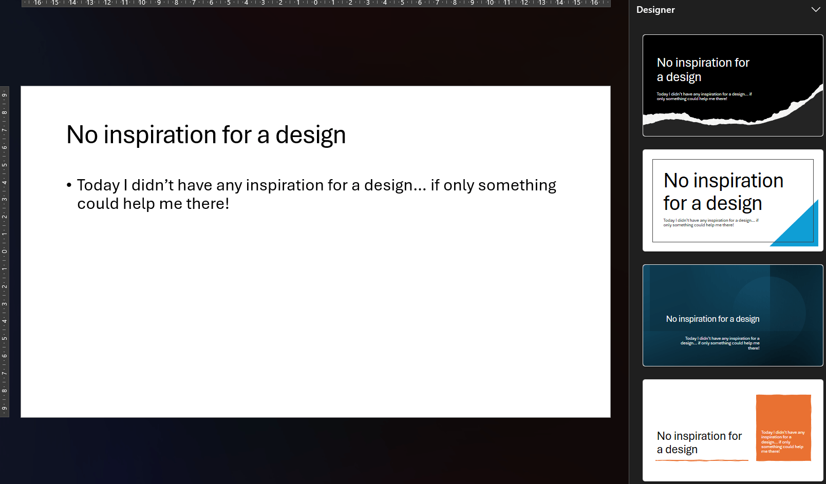
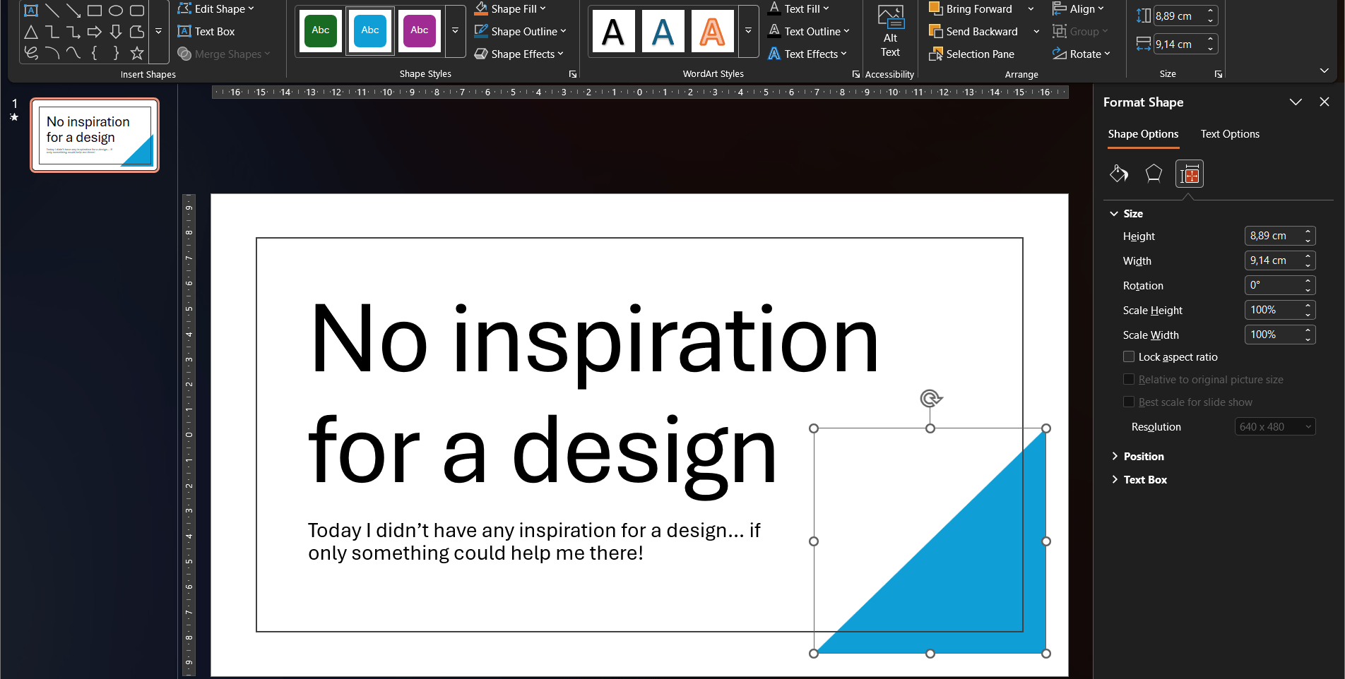
Sometimes the generated design fits the story but not quite the available space. I want to nudge a shape a few pixels to the left, or resize it to make room for an extra label. But nothing happens. The cursor does not change, the shape cannot be selected.

Take the blue triangle for example. I cannot move it or resize it. It is stuck.

A triangle shape selected on the slide showing no resize or move handles
Applied Designer layout: the triangle is selected but not editable

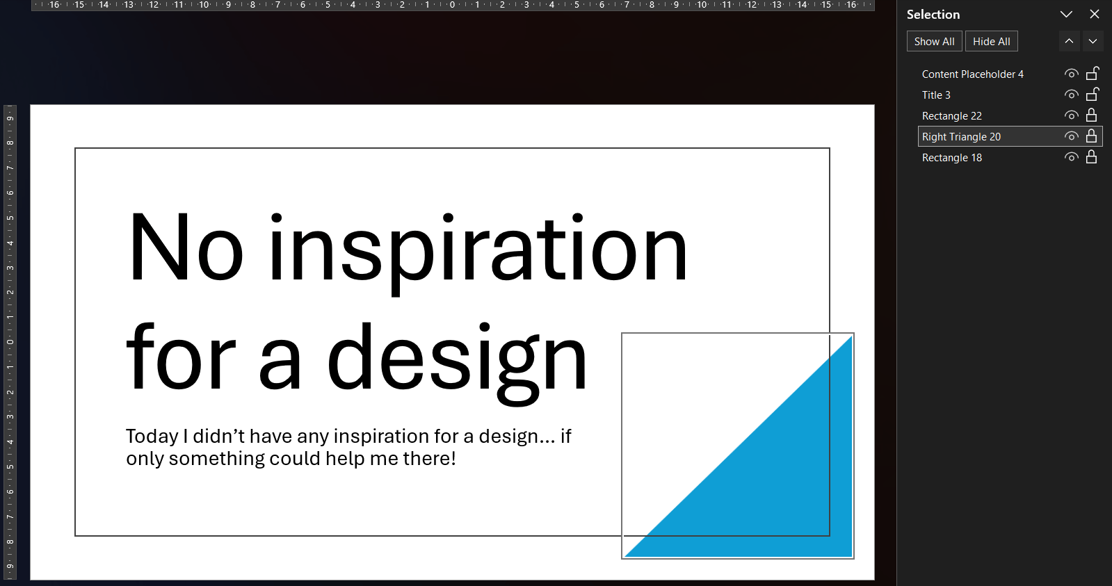
When you are able to select the shape, for example via the Selection pane, the ribbon only offers a handful of color options.

The ribbon showing only limited color-related controls for the locked shape
The ribbon is mostly grayed out for a locked Designer shape

The Format Shape pane is no help either, because it is grayed out too.

The Format Shape pane with all controls disabled
Format Shape pane: disabled for locked shapes

The built-in unlock option

As mentioned, Microsoft eventually added a Lock/Unlock option to the context menu. You can reach it by selecting the shape through the Selection pane, then pressing the context menu key on your keyboard.

The context menu revealing an Unlock option for a shape selected via the Selection Pane
Keyboard context menu key revealing the Unlock option

It works one locked shape at a time, or the whole slide if you select all. Across multiple slides, that adds up quickly.

But the bigger limitation is that the toggle is binary. It removes all locks from a shape, or sets them all at once. You cannot choose to allow movement while keeping the aspect ratio locked, or unlock text editing while preventing resizes. To get that level of control, you need to look at what is happening underneath.

Why Designer locks its shapes

I could not find an official Microsoft explanation why Designer locks the shapes. My guess is that Designer does not just insert shapes, it also manages them. When you click a different suggestion in the Designer pane, Designer finds all its own shapes and replaces them as a group. If any of those shapes had been moved, resized, or otherwise edited, that replacement would no longer produce a predictable result. Locking every shape protects the layout as a unit and keeps Designer in control.

Warning

The locks are there for a reason. Removing them may prevent Designer from cleanly replacing or updating the layout later. Proceed at your own risk.

Where the locks actually live

A PPTX file is a ZIP archive. The slides inside are stored as XML, and that is where the locking mechanism lives.

Each shape can carry lock attributes using the DrawingML a:spLocks element:

<a:spLocks noMove="1" noResize="1" noRot="1" noSelect="1" />

The a:spLocks element can carry up to ten boolean attributes, each disabling a specific editing action. PowerPoint respects all of them, but gives you almost no visible clue that it is doing so.

These ten locks are the granular controls that the PowerPoint UI hides from you. The built-in unlock toggle flips all of them at once. Once I knew where they lived, I could solve the rest with a small tool.

LockXML attribute
Disallow Shape Movementa:spLocks noMove
Disallow Shape Resizea:spLocks noResize
Disallow Shape Rotationa:spLocks noRot
Disallow Shape Point Editinga:spLocks noEditPoints
Disallow Showing Adjust Handlesa:spLocks noAdjustHandles
Disallow Arrowhead Changesa:spLocks noChangeArrowheads
Disallow Shape Type Changea:spLocks noChangeShapeType
Disallow Shape Text Editinga:spLocks noTextEdit
Disallow Aspect Ratio Changea:spLocks noChangeAspect
Disallow Shape Selectiona:spLocks noSelect

The design element marker

Alongside the locks, Designer also tags each shape it creates with a separate ownership marker in a proprietary Microsoft Office 2016 extension namespace:

<p16:designElem
xmlns:p16="http://schemas.microsoft.com/office/powerpoint/2015/09/main"
val="1" />
MarkerXML element
Is a design elementp16:designElem

This is not a lock. It is the flag Designer uses to identify its own shapes. When you pick a different layout, Designer finds every shape marked with p16:designElem and replaces them as a group. Clearing this flag turns the shape into a regular element that Designer will no longer recognize or try to replace.

Note

The p16: namespace is a proprietary Microsoft extension and is not part of the public ECMA-376 Open XML standard. The Open XML SDK does expose p16:designElem as the DesignElement class, available in Office 2016 and above, but without a formal XML specification.

The app

I already wanted to give WinUI 3 a try and build with XAML again. It has been a long time since my UWP development days, so this was a fun excuse to do both.

The Open XML SDK (DocumentFormat.OpenXml) made reading and writing the PPTX structure straightforward. There is a typed C# class for almost every element in the spec, which made the implementation feel clean.

Slide Design Unlocker start screen with a button to select a .pptx file
Slide Design Unlocker: select a .pptx file to get started

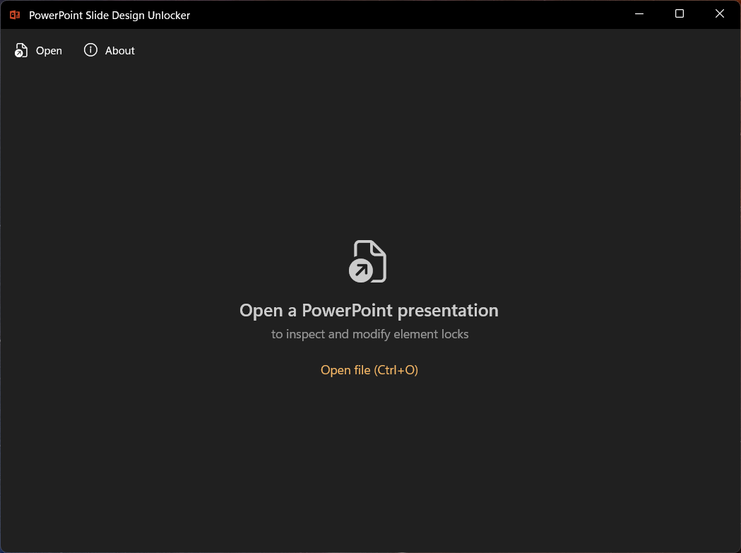
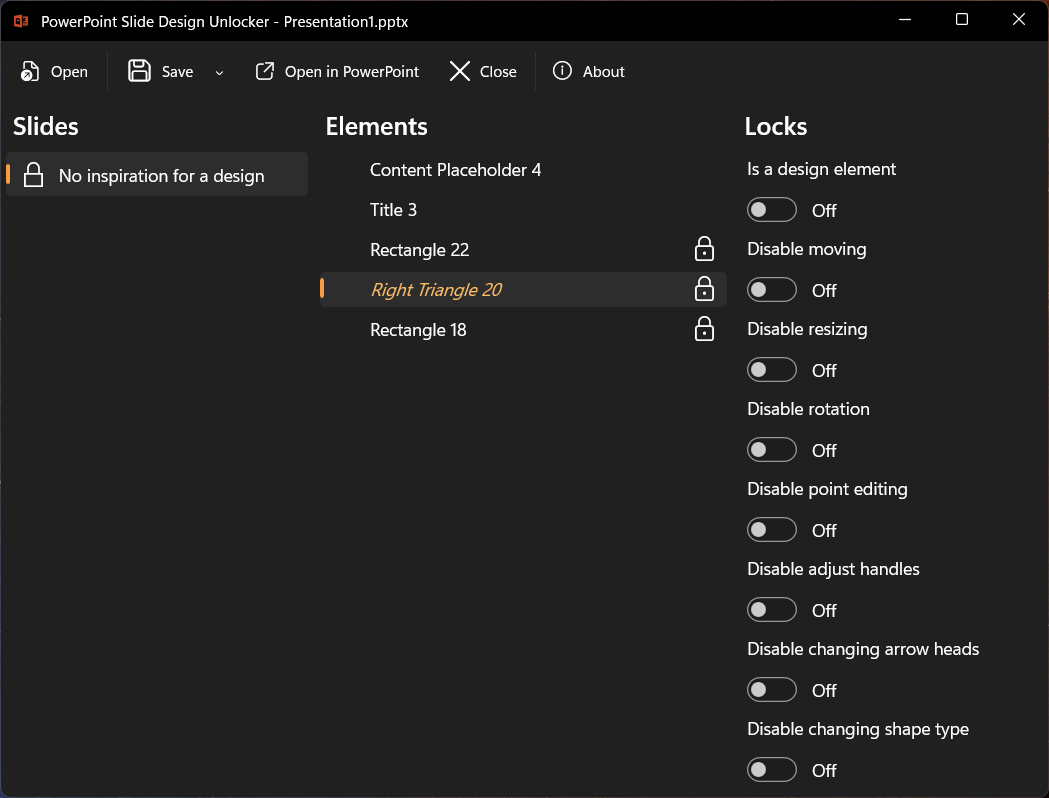
Slide Design Unlocker opens a .pptx file and shows three panels:

  • Slides on the left, with a padlock icon on any slide that contains locked shapes.
  • Elements in the middle, listing every shape on the selected slide, again with a padlock icon for those that carry active locks.
  • Locks on the right, with toggle switches for the ten locks and the design flag for the selected shape. These map directly to the XML attributes listed above.
Slide Design Unlocker showing the Slides, Elements, and Locks panels with padlock icons
Slide Design Unlocker: main window with the three panels

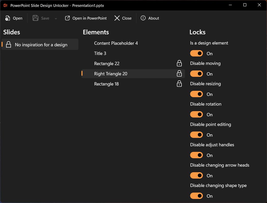
Turn off the toggles for the shape you want to edit.

The Locks panel showing toggle switches, now unlocked for the selected rectangle
The lock toggles for the selected shape, now unlocked

Save and reopen the file in PowerPoint. The shape is now a normal, editable element.

The triangle shape now showing full resize and move handles after unlocking
The triangle is now fully editable in PowerPoint

Note

The app only modifies the XML lock flags. Styles, animations, and theme settings stay untouched.

Bonus: lock shapes the other way

Because the toggles are symmetric, the app works in both directions. If you want to protect a shape from accidental changes, like a carefully positioned logo, a decorative element you spent time aligning, or a chart you do not want nudged, you can enable the relevant locks yourself. Designer is not involved: the same a:spLocks attributes work on any shape in any presentation.

Get it from the Microsoft Store

I actually started building this application over four years ago, when PowerPoint did not have the lock/unlock toggle in the UI at all. I just never got around to finishing and publishing it.

Even now, the built-in option is limited to all-or-nothing. That is where the ten individual lock settings make the difference, and why I still use my app regularly.

Slide Design Unlocker is free, requires no account or sign-in, and transmits no data or telemetry. It is available now in the Microsoft Store, and the source code is also available on GitHub.

If you run into something unexpected, have a suggestion, or just want to share what you unlocked, feel free to reach out to me.

Filed under Office
Last update:
/ Michaël Hompus

The SmartArt gallery in PowerPoint for the desktop does not show every layout that exists. Some only appear through Designer suggestions, and others are tucked away in the web version of PowerPoint. In this post I catalog every layout I have found that is missing from the desktop SmartArt menu, show what each one looks like, and provide a downloadable PPTX file with copy-and-paste-ready diagrams.

The desktop SmartArt gallery in PowerPoint does not show every layout that exists. After some experimentation, I found 23 layouts that are missing from it. Some only surface through Designer suggestions, and a second group only appears in the SmartArt menu of PowerPoint for the web. In this post I catalog all of them, show what each one looks like, and include a downloadable PPTX with copy-and-paste-ready diagrams.

I discovered this by accident. While working with PowerPoint on the desktop, the Designer suggested a diagram style I had never seen in the SmartArt gallery. I went back to Insert > SmartArt to look for it. It simply was not there. That sent me down a rabbit hole of typing different bullet lists and watching what Designer would suggest.

How to access them

  1. Open a blank slide in PowerPoint.
  2. Type a short bulleted list (3 to 5 items work best).
  3. Open the Designer pane from the Home tab or press Design > Designer.
  4. Scroll through the suggestions. Some of the proposed layouts are SmartArt diagrams that you will not find in the SmartArt gallery.

Tip

Designer needs an active Microsoft 365 subscription and an internet connection to generate suggestions. Make sure both are available.

Overview

The 23 layouts split into two groups: 15 that are only reachable through Designer, and 8 that also appear in the SmartArt menu of PowerPoint for the web. None of them show up in the desktop SmartArt gallery.

List-style layouts

LayoutAvailable via
Icon Label ListDesigner only
Icon Circle ListDesigner only
Icon Circle Label ListDesigner only
Icon Leaf Label ListDesigner only
Icon Label Description ListDesigner only
Centered Icon Label Description ListDesigner only
Icon Vertical Solid ListDesigner only
Vertical Solid Action ListDesigner only
Vertical Hollow Action ListDesigner only

Process and timeline layouts

LayoutAvailable via
Basic Process NewDesigner only
Basic Linear Process NumberedDesigner only
Linear Block Process NumberedDesigner only
Linear Arrow Process NumberedDesigner only
Vertical Down Arrow ProcessDesigner only
Chevron Block ProcessDesigner only
Repeating Bending Process NewWeb SmartArt menu + Designer

Timeline layouts

LayoutAvailable via
Basic TimelineWeb SmartArt menu + Designer
Horizontal Path TimelineWeb SmartArt menu + Designer
Horizontal Labels TimelineWeb SmartArt menu + Designer
Drop Pin TimelineWeb SmartArt menu + Designer
Rounded Rectangle TimelineWeb SmartArt menu + Designer
Hexagon TimelineWeb SmartArt menu + Designer
Accent Home Chevron ProcessWeb SmartArt menu + Designer

Designer-only layouts

These 15 layouts do not appear in any SmartArt menu. The only way to get them onto a slide is through a Designer suggestion, on both the desktop and web versions of PowerPoint.

Note

The first few layouts show up frequently in Designer, so some people may not consider them “hidden” anymore. I include them for completeness, because they still do not appear in the desktop SmartArt gallery. The remaining layouts are much more elusive: I have only seen them a handful of times.

Icon Label List

Each item gets a small icon on the left with a short caption beside it. The layout arranges items horizontally, so it works best with 3 to 5 concise labels. Think feature highlights or a row of team roles.

Icon Label List layout with sample items
Icon Label List

Icon Circle List

Icons sit inside colored circles with a heading and a short description underneath each one. The circles give the slide a polished, uniform look. A good pick for introducing team members, product pillars, or service categories.

Icon Circle List layout with sample items
Icon Circle List

Icon Circle Label List

A variation of the Icon Circle List where the label text is the star of the show. Each circle holds an icon, but the emphasis shifts to the heading text below, with descriptions taking a back seat. Use this when the category names matter more than the details.

Icon Circle Label List layout
Icon Circle Label List

Icon Leaf Label List

Icons are placed inside leaf-shaped holders, giving the slide an organic, softer feel compared to circles or rectangles. The layout works well for topics like sustainability, growth stages, or anything that benefits from a less corporate visual style.

Icon Leaf Label List layout
Icon Leaf Label List

Icon Label Description List

Each item has three layers: an icon, a bold heading, and a longer description paragraph. The items are arranged horizontally and give equal space to each entry. Ideal for feature comparisons or explaining three to five concepts that each need a sentence of context.

Icon Label Description List layout
Icon Label Description List

Centered Icon Label Description List

The same icon-heading-description structure as the previous layout, but everything is center-aligned. This gives the slide a more balanced, symmetrical appearance. Works well for title slides or when the content is short enough that centered text stays readable.

Centered Icon Label Description List layout
Centered Icon Label Description List

Icon Vertical Solid List

Items are stacked top to bottom, each inside a solid colored bar with an icon on the left and text on the right. The vertical orientation makes it suitable for slides with more items or longer descriptions than the horizontal variants can handle.

Icon Vertical Solid List layout
Icon Vertical Solid List

Vertical Solid Action List

Full-width solid bars stacked vertically, each holding a heading and description. No icons, no numbering, just bold blocks of color that give every item equal visual weight. A strong choice for agenda slides or listing key takeaways.

Vertical Solid Action List layout
Vertical Solid Action List

Vertical Hollow Action List

The outlined counterpart of the Vertical Solid Action List. Instead of filled bars, each item sits inside a bordered rectangle. The lighter look leaves more breathing room on the slide and works better on slides that already have a colored background.

Vertical Hollow Action List layout
Vertical Hollow Action List

Basic Process New

A minimal left-to-right process flow. Each step is a colored rectangle connected by arrows, without numbering or extra decoration. Clean enough for a simple three-step workflow or onboarding flow.

Note

This one is only slightly different from the Basic Process layout that is available in the desktop SmartArt menu, but it has square corners and smaller arrows.

Basic Process New layout
Basic Process New

Basic Linear Process Numbered

Each step gets a large auto-generated number alongside a heading and description. The steps flow left to right in rectangular blocks connected by arrows. Useful when the sequence order of your steps matters and you want readers to follow 1-2-3.

Basic Linear Process Numbered layout
Basic Linear Process Numbered

Linear Block Process Numbered

Similar to the Basic Linear Process Numbered but with thicker, blockier shapes that fill more of the slide. The heavier visual style draws more attention and works well when the process is the main message of the slide.

Linear Block Process Numbered layout
Linear Block Process Numbered

Linear Arrow Process Numbered

Numbered steps connected by prominent arrows, with text appearing in callout-style shapes that pop out from the flow line. Each step stands out more than in the block variants, making this a good fit for presentations where you walk through each step one at a time.

Linear Arrow Process Numbered layout
Linear Arrow Process Numbered

Vertical Down Arrow Process

Steps flow from top to bottom instead of left to right. Each step is a downward-pointing arrow with the heading inside and a description beside it. Natural for content that involves drilling down, filtering, or funneling.

Vertical Down Arrow Process layout
Vertical Down Arrow Process

Chevron Block Process

Chevron-shaped arrows carry the heading text while rectangular blocks above them hold the descriptions. The chevrons create a strong visual flow from left to right. A solid choice for roadmaps or phase-based plans.

Chevron Block Process layout
Chevron Block Process

Layouts available in the web SmartArt menu

The following 8 layouts do appear in the web app’s SmartArt menu, but only when you use PowerPoint for the web. On the desktop they are still hidden and can only surface through Designer suggestions. If you primarily work in the desktop app, these are just as invisible as the group above.

Repeating Bending Process New

A zigzag flow that bends back and forth across the slide. Instead of running off the right edge, steps wrap to the next row. Well suited for longer processes with six or more steps that need to fit on a single slide.

Note

In my experience, this layout is a bit buggy if you alter it in PowerPoint. The numbers on the arrows do not update correctly when you add or remove steps.

Repeating Bending Process New layout
Repeating Bending Process New

Basic Timeline

A horizontal timeline line with rounded rectangles for event descriptions and dates placed below. Straightforward and easy to read, good for project milestones or a brief history overview with up to five or six events.

Basic Timeline layout
Basic Timeline

Horizontal Path Timeline

Events sit in rectangles connected by a dotted path with circular markers at each stop. The path gives it a journey or roadmap feel, making it a natural fit for product release timelines or travel itineraries.

Horizontal Path Timeline layout
Horizontal Path Timeline

Horizontal Labels Timeline

Dates and labels sit directly above or below a horizontal line, without separate description boxes. The compact design keeps the slide clean and works best when each event only needs a short label, like version numbers or quarter names.

Horizontal Labels Timeline layout
Horizontal Labels Timeline

Drop Pin Timeline

Each event is marked with a map-pin shape, giving the timeline a location-themed look. The date appears near the pin head and the description below. A playful option that works well for travel recaps, office openings, or any content with a geographic angle.

Drop Pin Timeline layout
Drop Pin Timeline

Rounded Rectangle Timeline

Dates are the focal point here, displayed inside large rounded rectangles along the timeline. Descriptions sit beside or below them in plain text. Choose this when the dates themselves are the main message, such as deadlines or key decision moments.

Rounded Rectangle Timeline layout
Rounded Rectangle Timeline

Hexagon Timeline

Similar to the Rounded Rectangle Timeline, but dates sit inside hexagonal shapes. The angular geometry gives the slide a more technical, eye-catching look. A good match for engineering milestones or sprint-based planning.

Hexagon Timeline layout
Hexagon Timeline

Accent Home Chevron Process

Chevron and home-plate-shaped accents carry the headings, with description boxes placed above them. More decorative than the Chevron Block Process and a good fit when you want a process diagram that also catches the eye in a print-out or PDF export.

Accent Home Chevron Process layout
Accent Home Chevron Process

Note

Although this layout has “Process” in the name, it is found in the timeline section of the web SmartArt menu.

Layout URNs for technical reference

Each SmartArt layout is identified internally by a unique URN. If you open a PPTX file in a ZIP editor, you can inspect the uniqueId attribute in the diagram XML to confirm which layout is on a slide. This is useful if you find a new hidden layout and want to verify whether it already appears in the list above.

Show layout URNs

All URNs share the common prefix urn:microsoft.com/office/officeart/. The table below shows only the version and layout name suffix.

TitleuniqueId suffix
Icon Label List2018/2/layout/IconLabelList
Icon Circle List2018/2/layout/IconCircleList
Icon Circle Label List2018/5/layout/IconCircleLabelList
Icon Leaf Label List2018/5/layout/IconLeafLabelList
Icon Label Description List2018/2/layout/IconLabelDescriptionList
Centered Icon Label Description List2018/5/layout/CenteredIconLabelDescriptionList
Icon Vertical Solid List2018/2/layout/IconVerticalSolidList
Vertical Solid Action List2016/7/layout/VerticalSolidActionList
Vertical Hollow Action List2016/7/layout/VerticalHollowActionList
Basic Process New2016/7/layout/BasicProcessNew
Basic Linear Process Numbered2016/7/layout/BasicLinearProcessNumbered
Linear Block Process Numbered2016/7/layout/LinearBlockProcessNumbered
Linear Arrow Process Numbered2016/7/layout/LinearArrowProcessNumbered
Vertical Down Arrow Process2016/7/layout/VerticalDownArrowProcess
Chevron Block Process2016/7/layout/ChevronBlockProcess
Repeating Bending Process New2016/7/layout/RepeatingBendingProcessNew
Basic Timeline2016/7/layout/BasicTimeline
Horizontal Path Timeline2017/3/layout/HorizontalPathTimeline
Horizontal Labels Timeline2017/3/layout/HorizontalLabelsTimeline
Drop Pin Timeline2017/3/layout/DropPinTimeline
Rounded Rectangle Timeline2016/7/layout/RoundedRectangleTimeline
Hexagon Timeline2016/7/layout/HexagonTimeline
Accent Home Chevron Process2016/7/layout/AccentHomeChevronProcess

Grab the PPTX and use these layouts in your own slides

I put together a PowerPoint file that contains every hidden layout listed above, pre-filled with placeholder content. You can download it, open the slide you need, and copy the diagram straight into your own presentation.

Download the PPTX with all hidden SmartArt layouts

Because these diagrams are regular SmartArt once they are on a slide, you can edit the text, change colors, and resize them just like any other SmartArt graphic.

Help me discover more

I am fairly sure I have not found all of them yet. Designer suggestions can vary based on your content, the number of bullet points, and possibly even your region or subscription tier.

If you come across a layout that is not in my list, I would love to hear about it.
Drop me a message and I will add it to this post.

Happy diagramming!

Filed under Office
Last update:
/ Michaël Hompus

The arc42 template is a great structure, but structure alone does not keep documentation alive. In my talk I end with the practical part: where to store the docs, how to review them, how to avoid drift, and how to use agents as guardrails. This post captures those "after the template" slides in a form you can actually use.

The previous 12 chapter posts in this series walked through the arc42 template, chapter by chapter.

But this is my practical series, so I want to end with the practical part: where to store the docs, how to review them, how to avoid drift, and how to use agents as guardrails.

The awkward truth

Documentation does not die because people do not care. It dies because there is no workflow that keeps it connected to change.

arc42 gives you a solid structure for what to write. Now we need a structure for how it stays current.

A minimal workflow that works

This is the workflow I recommend when you want arc42 to stay alive:

  • Start early, use arc42 as a blank canvas, even on an existing system, not as a final report.

  • Keep it “minimal but honest”.
    Be concise, but do not document sections in isolation. The chapters in arc42 are connected: a constraint in chapter 2 might shape a decision in chapter 9, which in turn affects a building block in chapter 5. If you only look at one section at a time, you will miss those connections.

  • Have a team rule: every change that impacts architecture should have:

    • a documentation update that reflects the current state of the design (e.g. when adding or modifying a feature).
    • an ADR that records why a decision was made (e.g. when choosing a technology, pattern, or trade-off).

    These serve different purposes: the docs describe what is, the ADR explains why. Both should happen on significant changes.

  • Publish the docs in a readable form, and link them from the repo README.

  • Make the team the owner of the docs. The people who build the product maintain the documentation. If the product moves to an operations team, ownership of the docs transfers with it. Without clear ownership, nobody feels responsible, and the docs drift.

That last step matters more than it sounds. If nobody can find the docs, the docs do not exist.

Pick a home for your docs

You have three common options. None is perfect, so pick the one you will actually maintain.

Option 1: Word or requirements tooling

Examples: Microsoft Word, IBM DOORS, Siemens Polarion, Jama Connect.

This can work well for formal sign-off and audit trails, and in regulated industries these tools are often a contractual requirement.

The trade-off is iteration speed: when changes are frequent and reviews are slow, docs tend to describe the intended design rather than the current implementation. In my experience this can create a disconnect between what the docs say and what the code actually does.

Even in these tools, arc42 can still be used to structure the content, so you do not forget to write down all the important aspects.

Option 2: Wikis

Examples: Confluence, Azure DevOps Wiki.

Wikis are easy to edit and easy to collaborate on.

The trade-off is drift:

  • It is harder to review changes properly
  • It is easy for the wiki to diverge from the code
  • It is hard to enforce a “definition of done”

I find wikis useful when collaborating on designs, but in my experience, old designs are left and never cleaned up. That makes it hard to find the current docs, and easy for them to become outdated.

Option 3: In-repo docs (my default)

Examples: AsciiDoc, Markdown.

Plain text files in the same repo as the code.

You get:

  • PR-based review
  • Versioning together with the implementation
  • Enforceable checks (definition of done, linting, link checks, diagram builds)

A major advantage here is Diagrams as Code. Traditional drawing tools are a frequent reason documentation dies, because binary files are hard to update and hard to diff, or because the source can no longer be accessed or found. By using tools like Mermaid.js, PlantUML, or Structurizr, your diagrams become plain text that renders automatically.

This is my default choice, however, it is not a silver bullet. Accessibility and readability can be an issue, especially for non-technical stakeholders. I prefer to have the CI pipeline publish the docs in a readable form (e.g. HTML or PDF) and link them from the README, to make sure they are easy to read and distribute.

For this, Asciidoctor can render AsciiDoc to HTML or PDF. Doxygen, originally an API documentation tool, can also build full websites from Markdown with interlinking and embedding, which makes it useful for architecture docs too. If you are looking for something built specifically for arc42, docToolchain generates HTML and PDF from AsciiDoc-based arc42 documents and integrates with CI pipelines.

Tip

If your team already works in pull requests, in-repo docs use the workflow you already have.

Minimum viable documentation: first week starter pack

If you want something you can start with on Monday, this is the smallest set that already prevents expensive misunderstandings:

  • Write the context and the most important goals (chapter 1).
    This is what stakeholders ask about first.
  • Write some constraints down (chapter 2).
    Constraints narrow the solution space before design begins.
  • Draw your service with its neighboring systems (chapter 3).
    A single diagram prevents I did not know we depend on that conversations.
  • Write only the top-level building blocks (chapter 5).
    Enough to show the major parts and their responsibilities.
  • Write the most important runtime flow (chapter 6).
    The one flow everyone needs to understand to work on the system.
  • Start an empty decision log (chapter 9).
    Even if it is empty, having the placeholder signals that decisions should be recorded.
  • Write a few quality scenarios (chapter 10).
    Explicit scenarios make “fast enough” and “secure enough” testable.

Notice that chapters 4 (Solution Strategy), 7 (Deployment View), 8 (Cross-cutting Concepts), 11 (Risks), and 12 (Glossary) are not on this list. They are valuable, but you can add them once the core is in place. Chapter 4 often emerges naturally from the decisions you record in chapter 9.

Then iterate. You will discover missing pieces because the structure nudges you into the gaps.

Greenfield vs. brownfield

This starter pack works for both new and existing systems, but the starting point is different.

On a greenfield project, you are filling in a blank canvas: start with goals and constraints, then design from there.

On a brownfield project, the system already exists, and the knowledge is often in people’s heads, not in a document. Start by interviewing the team: ask what the system does (chapter 1), draw the context together (chapter 3), and document the existing building blocks (chapter 5). You will find that writing things down surfaces assumptions and disagreements that were invisible before.

Tip

On brownfield projects, consider starting the glossary (chapter 12) early. Teams with years of accumulated jargon often have the most misunderstandings around what words mean. Writing the glossary first can surface those differences before they cause design mistakes.

Agents as guardrails

LLMs are good at reading natural language, and they tend to follow explicit rules consistently when those rules are part of the prompt context.

If you use agents (Copilot, Claude, Codex CLI, etc.), add a small instruction file in your repo that makes your arc42 document a source of truth.

Example AGENTS.md:

AGENTS.md
# Architecture guardrails
Before you propose or implement changes:
- Read the arc42 documentation in `docs/arc42/`.
- Treat it as the source of truth for constraints, decisions, and concepts.
- If a request conflicts with the docs, do not "pick a side".
Explain the conflict and propose a change to the docs (ADR), the code, or both.

This is not about replacing humans. It is about forcing inconsistencies to surface early.

That said, agents do not always verify what they claim. An LLM might report that it checked the docs without actually reading them, or follow some rules and quietly ignore others. Always verify that the output matches the documented constraints, especially for critical decisions.

Note

As a demo, I added an exotic constraint to the solution strategy: “all method names must contain an emoji”. An agent instructed to treat the arc42 docs as a source of truth will push back. C# identifiers cannot contain emoji characters, so the agent is stuck between two architectural rules: the naming constraint and the requirement that code must compile and pass tests. Instead of silently picking one, the agent flags the conflict and asks what to do. That is exactly the behavior you want: surface the inconsistency, do not hide it. Codex cannot comply with conflicting rules

Keeping it alive: reviews and drift

A workflow is only as good as the review habit behind it. Without a review cadence, docs drift silently until someone finds a lie in chapter 5 during an incident.

A lightweight approach that works:

  • On every PR that touches architecture: update the relevant arc42 sections as part of the definition of done. A concrete DoD entry could be: “arc42 docs reviewed and updated for any architectural impact”.
  • After every significant decision: add or update an ADR in the decision log (chapter 9).
  • Quarterly (or after a major release): do a full read-through of chapters 14 with the team. Are the goals still correct? Have constraints changed? Is the context diagram still accurate?
  • Annually: review the full document. Update the glossary, and check that the deployment view matches reality.

The goal is not perfection. It is making drift visible before it becomes expensive.

Wrap-up

The template is only half the game. The other half is having a workflow that makes updates cheap, reviewable, and hard to forget.

If you arrived here directly, the full series walks through every chapter with copy/paste structures, examples, and checklists. The Pitstop example that runs through the series is available as a GitHub Gist.

The arc42 website and its documentation are the best starting points when you want to dive deeper. The FAQ covers common questions, the Quality Model (Q42) helps with quality scenarios, and the Software architecture canvas is a great tool for workshops.

Make some lovely documentation!

/ Michaël Hompus

Chapter 12 builds shared language. It explains the terms, abbreviations, and domain concepts used throughout the architecture document, so readers do not have to guess what words mean or how the team uses them. In this article I explain what belongs in chapter 12, what to keep out, a minimal structure you can copy, plus a small example from Pitstop.

This post is about chapter 12: Glossary, the last chapter in the “Reality and shared language” group, and the final chapter of the arc42 template.

A glossary can be a simple list of abbreviations. That is useful, but it is not the main point. The real value is shared meaning: domain terms, recurring concepts, and words that teams use differently. If you practice Domain-Driven Design (DDD), this is where you document your Ubiquitous Language. If you do not use DDD, think of it as the vocabulary the whole team agrees on.

If readers have to ask “what do you mean by that?” while reading the document, the answer should probably live here.

The stakeholders you identified in chapter 1 are your target audience. Their vocabulary and assumptions should drive which terms you define.

Note

A glossary is not a dictionary. It is a list of the terms that matter for this system and this document.

What belongs in chapter 12 (and what does not)

Chapter 12 of an arc42 document answers:

Which terms do readers need to understand this document without guessing?

What belongs here:

  • Domain terms that show up throughout the document:
    the core nouns and verbs of the system (work order, appointment, bay, reschedule, etc.).
  • Abbreviations and acronyms:
    internal shorthand like ADR, RBAC, SSO, WS, SSE, OLTP.
  • Architecture-specific terms and concepts you use repeatedly:
    for example “source of truth”, “degraded mode”, “idempotency key”, “read model”.
  • Homonyms: words that look the same but mean different things in different contexts
    (for example “order”, “status”, “sync”).
  • Synonyms: different words your team uses for the same concept.
    Pick one canonical term and document the alternatives as aliases.
  • Ownership of meaning:
    when a term is a contract with an external neighbor, link to where it is specified (chapter 3 or an API spec).
  • Translations and language mapping when the domain and the document use different languages:
    a consistent mapping from “local language term” ↔ “document term” so the whole team speaks the same language.

Tip

If your organization already has a central glossary (enterprise/domain/platform), link to it. Do not copy it into this document.
Chapter 12 should only define the terms that are used in this architecture or that have a local meaning.

What does not belong here:

  • Long tutorials or deep technical explanations.
    Keep definitions short and link to a concept section (chapter 8) when more detail is needed.
  • A duplicate of the full domain model.
    If you need the full model, link to it, and keep chapter 12 as the shared vocabulary summary.
  • Terms that are obvious to your audience and only used once.
    If it is not used, it does not belong.
  • API field definitions and payload-level vocabulary.
    API reference docs have their own glossaries. Chapter 12 covers architecture-level terms, not message schemas.

Tip

If a term appears in multiple chapters and could be interpreted in different ways, add it to the glossary early. Future you will thank you.

Abbreviations are not enough

It is common to treat the glossary as an acronym list. That helps, but it does not solve the harder problem: shared understanding.

A better checklist for adding items:

  • Does this term show up in multiple chapters?
  • Could two stakeholders interpret it differently?
  • Is this term used as a contract with a neighbor system?
  • Would a new team member stumble on it?

If the answer is yes, it belongs here.

Translations and mixed-language domains

Some domains are bilingual by nature: the business uses Dutch terms, the code uses English, and the document ends up mixing both.

If your team runs into this, document the mapping explicitly.

A practical approach:

  • Pick one primary term for the document (usually the one used in code).
  • Add the alternative term as an alias.
  • If needed, add a short note on where the term is used (UI label, code name, external system name).

This reduces friction in discussions and prevents subtle misunderstandings.

The minimum viable version

If you are short on time, aim for this:

  • 5–10 terms: only the ones that are used repeatedly or can be misunderstood.
  • 1–2 lines per term.
  • Include acronyms that appear in headings, diagrams, or tables.

That is enough to make the document readable for newcomers.

Copy/paste structure (Markdown skeleton)

Use this as a starting point.

12-glossary.md
## 12. Glossary
<Short intro: what kinds of terms are defined here?>
### Terms and Abbreviations
<!-- Alphabetical order is not required, but most readers like it. -->
- **<Term or abbreviation>**
<Meaning or description. Notes or aliases go here.>
- **<ABBREVIATION>**
_<Full form>_
<Meaning or description.>
### Translations (optional)
<Only if your domain and document use different languages.>
| Term (document) | Term (domain / UI) | Notes |
| :-------------- | :----------------- | :---- |
| ... | ... | ... |

Note

Alphabetical order is common and readers tend to expect it, but it is not a requirement. What matters most is that the list is consistent and easy to scan.

Example (Pitstop)

Pitstop is my small demo system for this series. It is intentionally simple, so the documentation stays shareable.

Below is a short example excerpt.

12. Glossary

Terms and Abbreviations

  • ADR
    Architecture Decision Record
    A document that captures an important architectural decision, its context, and its consequences. Stored in chapter 9 of this document.
  • Appointment
    A scheduled time slot owned by the Planning Service. Pitstop imports this and maps it to a work order.
    External term; owned by the Planning Service (see chapter 3). Also referred to as “slot” in the Planning API.
  • Degraded mode
    A mode where the workshop UI can continue during connectivity loss. Uses a local queue and replay.
  • Idempotency key
    A key that makes repeated messages safe to process multiple times. Prevents duplicate state changes on retries.
  • RBAC
    Role-based access control
    A model that restricts system access based on the roles assigned to users.
  • Source of truth
    The system that owns the authoritative state for a concept. Planning owns appointments, Pitstop owns work order status.
  • Status
    In Pitstop, “status” always means work order status (the lifecycle from createdin-progressdone).
    The Planning Service uses “status” for appointment state (confirmed, cancelled, no-show), and the sync layer tracks its own sync status (pending, synced, failed).
    When reading this document, assume work order status unless the text says otherwise.
  • SSE
    Server-sent events
    A server push technology that lets a server stream events to a browser over a single HTTP connection.
  • Work order
    The unit of work in the workshop. Contains tasks, status, notes, and audit trail. Central aggregate (see chapter 8).
  • WS
    WebSocket
    A protocol that provides full-duplex communication over a single TCP connection.

Translations

Term 🇺🇸 (document)Term 🇳🇱 (domain / UI)Notes
Work orderWerkorderUI label used by garages.
WorkshopWerkplaatsUsed in training materials and onboarding.

To browse the full Pitstop arc42 sample, see my GitHub Gist.

Common mistakes I see (and made myself)

  1. Only listing acronyms
    Acronyms help, but they do not solve shared meaning for domain terms.

  2. Defining terms that are never used
    A glossary is part of the architecture document, not a trivia list.

  3. Definitions that are too long
    If a definition needs a page, you probably need a concept section (chapter 8) and a short summary here.

  4. No alias handling
    If the same concept has two names, document both. Otherwise your team will keep arguing about words instead of system behavior.

  5. Not maintaining it
    Every time you introduce a new recurring term, update the glossary. It is cheap work with high return. A practical trigger: review the glossary whenever you write an ADR, add an integration, or onboard a new team member.

Done-when checklist

🔲 Key domain terms used across the document are defined.
🔲 Acronyms and abbreviations are explained.
🔲 Ambiguous terms have explicit meaning for this system.
🔲 Mixed-language terms have a clear mapping (if relevant).
🔲 A new team member can read the document without asking “what does this mean?” repeatedly.

Next improvements backlog

  • Add links from glossary terms to the first chapter where they are introduced.
  • Add aliases for terms used in UI labels, code, and external systems.
  • Review the glossary with a stakeholder who did not write the document.

Wrap-up

Chapter 12 is short, but the return is real. When the glossary is good, every other chapter becomes easier to read and easier to discuss.

This concludes the arc42 template itself.
The series is not done though.

Next up: After the 12 chapters: keep your arc42 docs alive, where I cover where to store the docs, how to review them, how to avoid drift, and how to use agents as guardrails.

/ Michaël Hompus

Chapter 11 keeps uncomfortable truths visible. It records the risks and technical debt that can still bite you later, so they do not stay hidden in someone's head or scattered across chat logs. In this article I explain what belongs in chapter 11, what to keep out, a minimal structure you can copy, plus a small example from Pitstop.

This post is about chapter 11: Risks and technical debt, the first chapter in the “Reality and shared language” group.

The first ten chapters built up the architecture story: goals, constraints, structure, runtime, deployment, concepts, decisions, and quality scenarios.

Chapter 11 is where we stop pretending everything is solved. It is where I write down what can still go wrong, what we knowingly postponed, and what we have not figured out yet.

Note

Teams that write risks down early tend to be calmer in production.

What belongs in chapter 11 (and what does not)

Chapter 11 of an arc42 document answers:

What can still hurt us later, and what are we doing about it?

What belongs here:

  • Architecturally relevant risks, including:
    • product and adoption risks (does the workflow fit reality?)
    • integration risks (vendor stability, contract changes, rate limits)
    • operational risks (backup, monitoring gaps, single points of failure)
    • security and compliance risks (data exposure, audit gaps, retention)
    • performance and scalability risks (hot paths, growth limits)
  • Technical debt that affects maintainability, reliability, or delivery speed: the things you deliberately postponed that now need a visible trail.
  • For each risk or debt item:
    • a clear statement
    • why it matters (impact)
    • how likely it is (roughly)
    • mitigation or next step
    • owner (a person, role, or team)
    • trigger or early warning (optional): how will you know this risk is starting to happen? This is different from mitigation: it is the signal that tells you to act. Think: a metric crossing a threshold, an error rate spike, a support ticket pattern.
  • Cross-links to the rest of the document: constraints in chapter 2, strategy in chapter 4, runtime scenarios in chapter 6, deployment assumptions in chapter 7, reusable concepts in chapter 8, decisions in chapter 9, and quality scenarios in chapter 10.

What does not belong here:

  • A full project management backlog. Keep chapter 11 focused on items that can materially impact the architecture.
  • Sensitive vulnerability details in public documentation. It is fine to record security risks at a high level, but do not publish exploit steps, internal endpoints, or secret material. Link to a private ticket or security register if needed.
  • A duplicate of chapter 9. Decisions belong in chapter 9, risks and debt belong here. When a risk is addressed by a decision, link to the ADR.

Tip

If something feels uncomfortable to say out loud, it probably belongs in chapter 11.

Risks vs technical debt

A simple distinction that works well:

  • A risk is something that might happen. You manage it with mitigation, monitoring, and contingency plans.
  • Technical debt is something that already happened. You chose a shortcut or postponement, and it has an interest rate.

Both are normal. Hiding them is what hurts.

Open questions and postponed decisions

Postponing architectural choices is often a very good practice. You wait for more certainty, more feedback, and more clarity before committing.

But not making a decision is also a risk. At best, you forget it still needs to be made. At worst, someone assumes it is already decided and starts building based on that assumption.

I use chapter 11 to make those “not-yet-decided” topics visible. It is not only a risk list, it is also a lightweight backlog of decisions that still need daylight.

Tip

Keep open questions visually distinct from risks. Pick a simple marker: a dedicated status like open question, a symbol, or a separate sub-section. That lets you scan them at a glance and prevents them from drowning in the mitigation entries.

The minimum viable version

If you are short on time, aim for this:

  • 3–5 risks that could realistically derail delivery, operations, or stakeholder trust
  • 3–5 technical debt items that you know will slow you down later

That is already enough to stop surprise work. You can always add more later.

Copy/paste structure (Markdown skeleton)

Use this as a starting point.

11-risks-and-technical-debt.md
## 11. Risks and technical debt
Risks are phrased as: _what could hurt us_ + _why it matters_ + _what we will do about it_.
| Risk / debt item | Why it matters | Mitigation / decision |
| :--------------- | :------------- | :-------------------- |
| ... | ... | ... |
<!-- add likelihood, owner, trigger columns when your process is ready -->
### Known technical debt (optional)
- <intentional shortcut><why acceptable now> ; <when to revisit>
- ...

Note

Tables are not mandatory. If you prefer a list format, keep it scan-friendly and keep the same fields per item.

If you are more serious about risk management, you can add likelihood and impact columns as in a risk matrix, and maybe even assign an owner.

Tip

Where you put open questions depends on how you work. If your process is strategy-driven (pick direction first, then refine), keeping open questions in chapter 4 works well, and you can link to chapter 11 when they become concrete risks. If your process is more risk-driven (track uncertainties and mitigation first), keep them in chapter 11 and link back to chapter 4 when they influence strategy.

Example (Pitstop)

Pitstop is my small demo system for this series. It is intentionally simple, so the documentation stays shareable.

Below is a small example list. It is not meant to be complete, it is meant to show the style and the level of detail.

11. Risks and technical debt

Risks are phrased as “what could hurt us” + “what we will do about it”.

Risk / debt itemWhy it mattersMitigation / decision
Integration ambiguity per Planning VendorEach vendor has different semantics (cancellations, reschedules, no-shows), causing inconsistent work ordersDefine a vendor mapping spec + contract tests; keep vendor-specific logic in adapters
Offline sync conflictsWorkshop can update while foreman/admin also edits → conflict resolution can become messyKeep conflict rules simple (append notes; validate status transitions); provide “needs foreman review” path
Backlog growth in sync queueVendor outage or slow API can pile up updates, delaying customer commsMonitor sync_queue_depth; circuit breaker; dead-letter queue + ops playbook
WebSocket instability in harsh networksReal-time UX can degrade unpredictably in garagesConfigurable fallback to polling (Realtime:FallbackToPollingSeconds); reconnect UX; track disconnect rates
Audit log volume / reporting loadAuditability creates data; dashboards can overload OLTP queriesUse read models; partition audit table; retention policies; optional replica for reporting

Known technical debt (intentional for v1)

  • Single backend instance per garage (no HA) → acceptable for v1; revisit for chains.
  • Minimal conflict resolution UI → acceptable initially; prioritize based on observed conflicts.

To browse the full Pitstop arc42 sample, see my GitHub Gist.

Common mistakes I see (and made myself)

  1. Treating this as a shame list
    Chapter 11 is not for blame. It is for visibility and prioritization.

  2. No owners
    A risk without an owner is a wish. Put a person, role, or team on it.

  3. No next step
    A risk without a mitigation is just anxiety in table form. Even “decide in ADR-007” is better than nothing.

  4. Only technical risks
    Adoption, workflow fit, vendor behavior, and operations are often where the real pain starts.

  5. Deleting history
    Close items explicitly. If something was a risk and it is no longer a risk, document why.

  6. No links back to the architecture story
    Risks should connect back to the drivers and trade-offs. Otherwise the list becomes isolated and nobody acts on it.

Done-when checklist

🔲 The chapter lists the risks that could realistically hurt delivery or operations.
🔲 Technical debt items are visible, not hidden in chat and backlog noise.
🔲 Each item has an owner and a next step.
🔲 Items link to the relevant chapters, concepts, decisions, or scenarios.
🔲 The list is reviewed on a cadence (even if it is just “every release”).

Next improvements backlog

  • Add a simple severity sorting (impact × likelihood) to focus discussions.
  • Add a trigger column to your table once the basic list is stable.
  • Link security risks to a private register when details should not be published.

Wrap-up

Chapter 11 is what keeps the architecture document honest. You make risks and debt visible early, then refine them as you learn.

Next up: arc42 chapter 12, “Glossary”, where we build shared language so readers do not have to guess what terms mean.